Description:
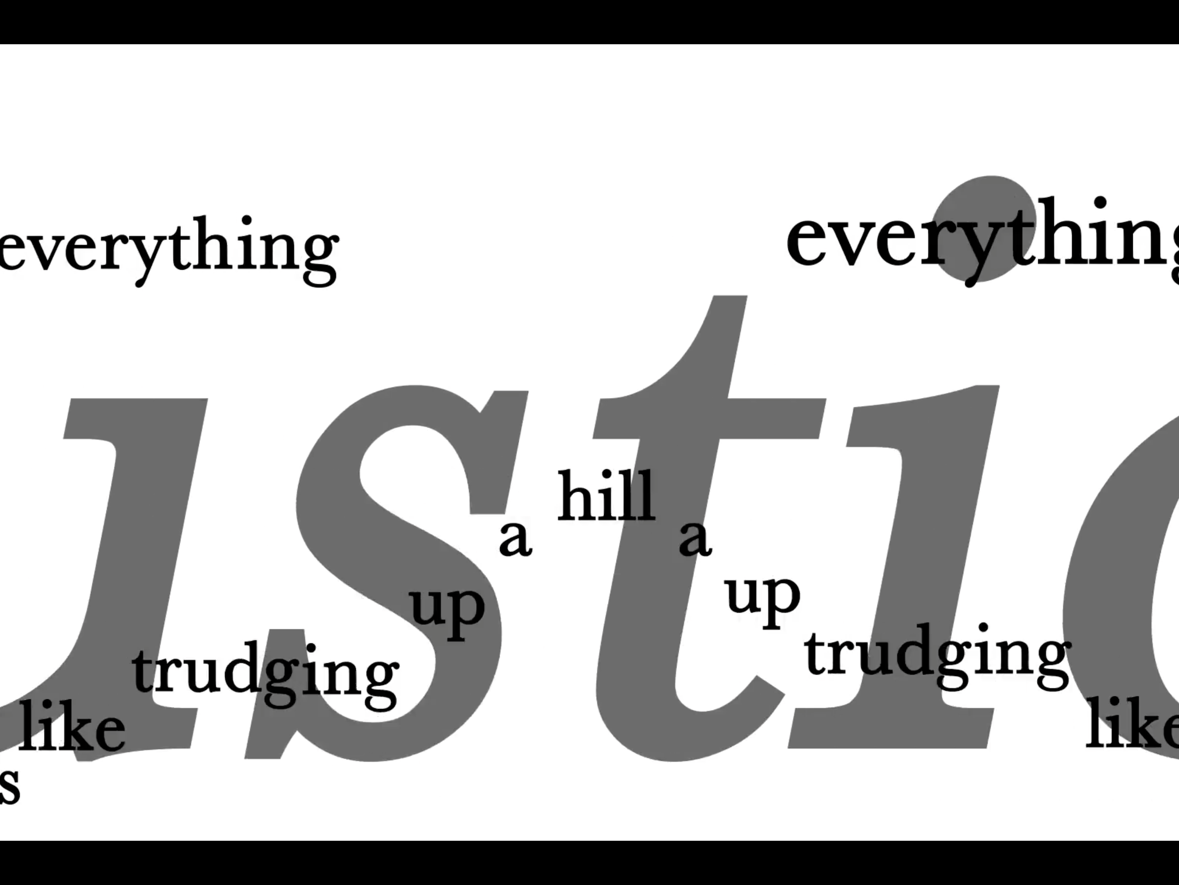
The Adobe Garamond Pro poster was created to not only present a brief amount of research into the font itself, but was also intended as a decorative poster for your home or office. The features come with a good hierarchy and a good amount of space to give the viewer enough breathing room to read while also showing close-ups of the features of the font. They include the eye in the lowercase "e", or it's curved descender of the uppercase "H". These are presented the most to show how the font stands out from others.
